Visual accessibility in source-code editors
The theme of perceptual readability in software development environments has been dear to my heart for over a decade. Accessibility topics around visual presentation are commonly associated with UI design, particularly in web development. It may at first feel like an odd idea to be willing to explore visual accessibility practices in the context of source code editing, but are these two disciplines truly divergent?
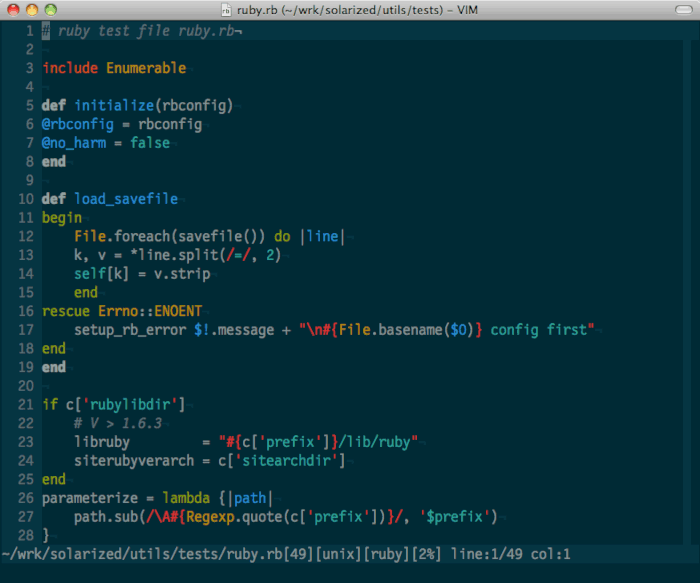
My interest in this topic started with Solarized, a precision colorscheme with selective contrast relationships between its colors. Its design decisions made me realize how most developers pick a colorscheme based on criteria solely related to aesthetics: bright and abundant colors, hard contrasts between the text and background, theming of the text based on UI elements instead of semantics, etc. It is hard to blame them, the colorschemes that come bundled with modern IDEs were designed to look immediately appealing and make the tool marketable.
As programmers, we should instead give priority to visual features that promote the legibility of the source code through the lens of our text editor. In this post, I will share my views on the visual components which contribute to productivity and accessibility in editing and navigating source code. Some of them are backed by research, while others remain rather empirical.
Contrasts
In the context of this post, contrast refers to the difference in color on a self-illuminated display of characters against either a background of a different color, or against other characters of a different color.
Thanks to the World Wide Web Consortium (W3C), there exist well specified requirements for making digital content visually accessible, especially to people with disabilities such as color vision deficiencies: the W3C Accessibility Guidelines (WCAG). The WCAG 2.x contrast specification in particular mandates that text should have a certain contrast ratio to achieve the highest standard of accessibility (AAA).
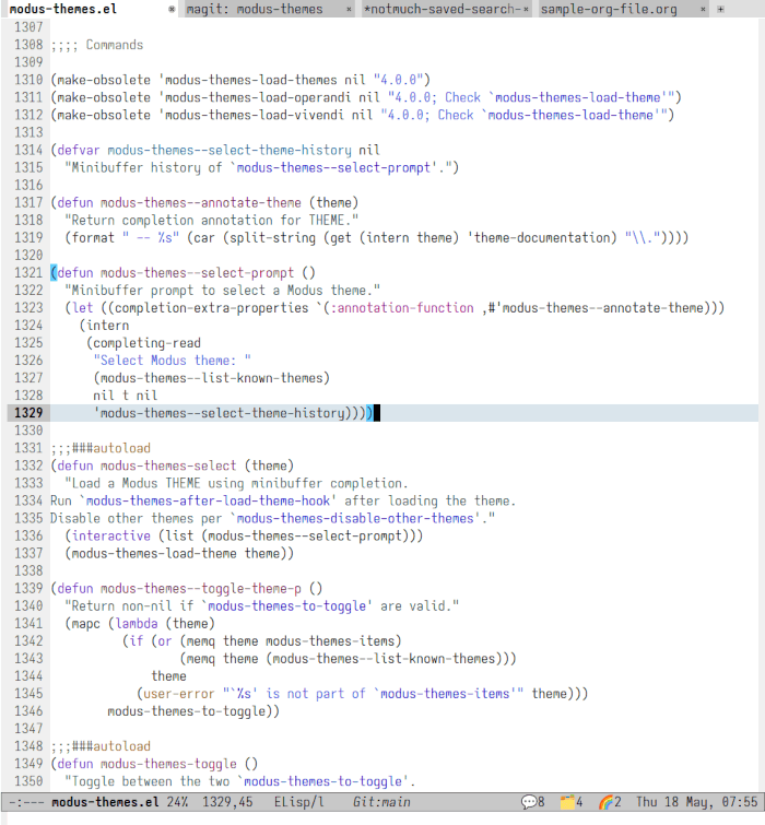
Some colorschemes were designed specifically to conform to the WCAG 2.x contrast guidelines. Possibly the most prominent one is Modus, but if you navigate source code on GitHub through a web browser, you will also be looking at some syntax highlighting that meets the most common WCAG 2.x standards (AA).
However, the WCAG contrast specification is not without flaws. Since WCAG 2.x came about in 2005, before modern technologies like smartphones, it doesn’t account for the different needs between light and dark modes. More specifically, some contrasts which aren’t perceptually uniform to humans pass WCAG 2.x conformance tests in dark color ranges improperly, making the standard unreliable for determining whether text is readable on a dark background. This aspect is particularly relevant in the context of text editors, which are often set up with dark backgrounds for programming to reduce visual fatigue. The issues of the WCAG 2.x contrast success criterion are well known, and currently being addressed by the APCA Readability Criterion (ARC)1.
While a high contrast between the characters printed on the screen and their background can certainly make the text more legible to people with visual disabilities, it also has a high potential for causing eye strain over extended periods of time. Resources on accessible contrast sometimes refer to the experience of reading on paper to illustrate the phenomenon: in normal lighting conditions, dark text on a page of paper has a contrast ratio that is much lower than pure black on white on a computer monitor, which is why reading a book isn’t as strenuous2.
Conversely, even the most colorful of syntax highlights can work without causing fatigue if foreground and background colors complement each other in a soft contrast.
Color Space
A color space is an organisation of colors represented by numeric
coordinates, such as red,green,blue in the sRGB color space,
cyan,magenta,yellow,key in the CMYK color space, or L*a*b* in the CIELAB
color space just to name a few.
Perceptually uniform colors are important for accessibility in the same way that perceptually uniform contrasts are: they match the way humans perceive colors. A color space achieves uniformity when numerical differences in coordinates represent equivalent visual differences, regardless of the location within the color space3. While there exists no color space that is perfectly uniform, there are models which provide a satisfying level of perceptual uniformity overall.
Color theory is a complex body of knowledge, however the notion of perceptual uniformity should be easy to grasp by comparing the following color gradients of the HSV representation of sRGB to the Oklab perceptual color space:


The are clear differences in lightness for different hues in the HSV color gradient above, which cause yellow, magenta, and cyan to appear much lighter than red and blue. On the other hand, all colors in the Oklab gradient appear with even lightness to the human eye.
This property, when applied to syntax highlighting in a text editor, is what makes certain keywords appear with the same relative importance to the person sitting behind the screen in spite of being highlighted in different colors.
Highlight Semantics
I touched on the topic of visual uniformity in previous sections of this post. There are multiple cases in source code editing where productivity and accessibility can in fact be increased by leveraging non-uniform visual cues.
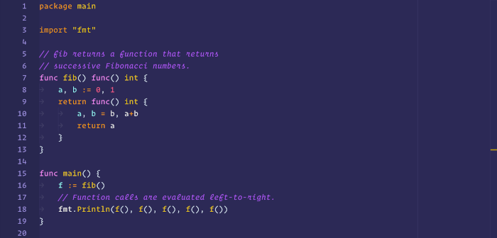
Parts of the syntax in a body of source code are more critical than others to the overall structure of a computer program. Although this topic is highly subjective, I would argue that even an unfamiliar code base can be made more legible by simply emphasizing three categories of syntax elements: control flow, declarations and constants. Such emphasis can be conveyed through variations in brightness and hue contrasts4, in reference to the practices described throughout previous sections of this post, and according to personal visual sensitivities.
The key takeaway here is that semantics trumps syntax when it comes to making the structure of source code easy to identify through a text editor. By using contrast variations, it is possible to create a visual hierarchy of syntax elements that reduces cognitive load when reading and writing code.
Font
So far I have been focusing on attributes related to colors. The last section of this post alludes to typography and its influence on accessibility in programming. Incidentally, the last picture from the previous section is the perfect segue into my next point.
When it comes to contrast, larger and thicker characters are perceived with a higher contrast than smaller and thinner ones due to their spacial attributes. This is demonstrated below through side by side text comparisons at different sizes and weights:
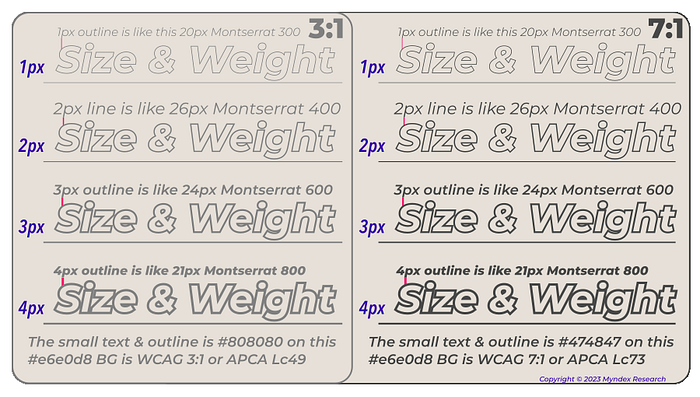
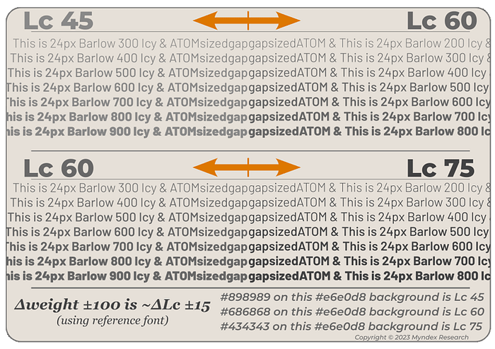
To compensate for this perceived difference in contrast, both APCA and WCAG 2.x recommend using a lower contrast ratio for large and bold elements like headlines5. One immediate consequence of these spacial characteristics is that the perceived contrast for the same text may vary from one typeface to another, for example due to varying character widths. To guarantee that typefaces conform to standards for accessible contrasts, APCA/WCAG 3 makes provision for comparing contrast calculations against these of reference fonts5.
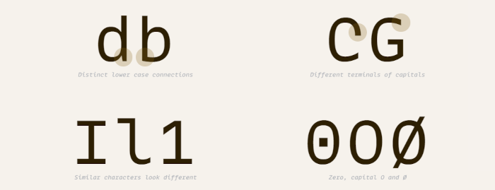
Furthermore, the choice of the typeface itself can affect the legibility of the source code significantly beyond contrast considerations. A good typeface should ensure that all characters are distinct and easy to identify in order to facilitate the reading flow and avoid ambiguity. These general truths about typography naturally apply to programming fonts.
Closing Words
Despite thorough research in certain areas such as perceptual contrast, we have very few tools for quantifying what makes source code syntax visually accessible and productive. Objective improvements in perceptual readability are difficult to measure and correlate with hierarchical syntax highlighting. We, programmers, often base our judgement on empirical analysis for lack of better approaches.
My conclusion, after experimenting extensively with different patterns of syntax highlights, is that syntax should be highlighted sporadically and subtly, but emphasize important keywords generously. This statement is very subjective; what works for my own perception can in no way be conflated with any kind of accessibility standard.
Don’t shy away from trying new things in your text editor for extended periods of times (days, weeks) with regards to syntax highlighting techniques and typography. You might surprise yourself finding out that your eyes flow over set ups which seemed unappealing at first: low colors, unusual color combinations, usage of boldness, a font with certain geometries, etc.
And remember, a syntax highlighting scheme driven by surrounding UI elements may be good for marketing, but it certainly isn’t for your eyes.
-
APCA is the Accessible Perceptual Contrast Algorithm. It is the candidate contrast method for the future WCAG 3. The interview How APCA Changes Accessible Contrast with Andrew Somers is packed with captivating details on the topic of perceptually uniform contrast. ↩
-
On the idea of not using pure black or pure white in design: Never Use Black. ↩
-
Source for the definition: Color difference (Wikipedia). ↩
-
For an illustrated explanation of hue contrasts, I recommend checking Color Theory - Contrast of Hue. ↩
-
See Visual Readability Contrast - Testing Criterion (ARC). The reference fonts are mentioned under the Font Lookup Tables title. ↩ ↩2
 This work is licensed under a Creative Commons Attribution 4.0 International License.